Discussion: First Look: Game Characters
Verfasst: 22. März 2010 20:05
ADMIN EDIT:
Today we will show you the first graphics of the game.
With this graphics we will show you how the game design will be.
We have taken all four characters from part 1 and we have added another two ones. Now, every person is associated to a country in the game. Your start country prescribe which figure you control. Then you can select your start airport in the country.
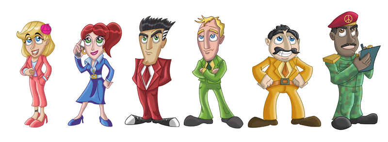
First all characters as Concept Art in the overview.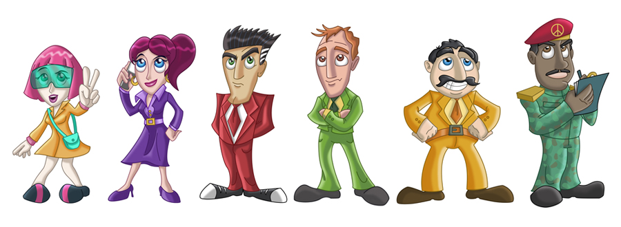
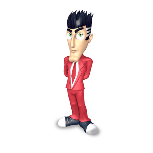
And here the conversion of a character as 3D model:
The both new characters are:
Miyu Takahashi (on the left)
Waweru Watanabe (on the right)
Tada! Here are the new edited graphics:
Please excuse if there are grammatical mistakes or spelling mistakes in the text. If you find a mistake, please send a personal message to me. I will immediately correct the mistake.
// END OF ADMIN EDIT
My Thoughts:
-Characters are too cartoon-y. Kind of feels like the game will be exclusively a kids game. AT1 had a the right realism/cartoon-ism ratio.
-As for the 2 new characters? Definitely will be nicer to have more competition. I found that once a competitor was eliminated in AT1 it would start to feel a bit boring like a party is starting to end. Then the 2nd competitor gets eliminated and now the party feels like it's over. I usually get bored and the game feels done before i even get into buying an expensive new plane. As for the the 2 new characters appearance, overall they're average or okay - nothing special and i won't be using them.
-And the 4 veteran characters from AT1: Tina's hair needs to go back to that red/orange she had in AT1. Siggi looks kinda drunk/hungover/dopey. He was the confident well groomed business man in AT1. What happened? Mario does look a bit dopey as well but not too bad. Igor is fine.
-Perhaps the option of a Canadian or American to help boost appeal/sales in North America. You could always limit the amount of characters able to be played to 6 and have more characters to choose from.
Anybody else have some thoughts?
Today we will show you the first graphics of the game.
With this graphics we will show you how the game design will be.
We have taken all four characters from part 1 and we have added another two ones. Now, every person is associated to a country in the game. Your start country prescribe which figure you control. Then you can select your start airport in the country.
First all characters as Concept Art in the overview.
And here the conversion of a character as 3D model:
The both new characters are:
Miyu Takahashi (on the left)
Waweru Watanabe (on the right)
Tada! Here are the new edited graphics:
Please excuse if there are grammatical mistakes or spelling mistakes in the text. If you find a mistake, please send a personal message to me. I will immediately correct the mistake.
// END OF ADMIN EDIT
My Thoughts:
-Characters are too cartoon-y. Kind of feels like the game will be exclusively a kids game. AT1 had a the right realism/cartoon-ism ratio.
-As for the 2 new characters? Definitely will be nicer to have more competition. I found that once a competitor was eliminated in AT1 it would start to feel a bit boring like a party is starting to end. Then the 2nd competitor gets eliminated and now the party feels like it's over. I usually get bored and the game feels done before i even get into buying an expensive new plane. As for the the 2 new characters appearance, overall they're average or okay - nothing special and i won't be using them.
-And the 4 veteran characters from AT1: Tina's hair needs to go back to that red/orange she had in AT1. Siggi looks kinda drunk/hungover/dopey. He was the confident well groomed business man in AT1. What happened? Mario does look a bit dopey as well but not too bad. Igor is fine.
-Perhaps the option of a Canadian or American to help boost appeal/sales in North America. You could always limit the amount of characters able to be played to 6 and have more characters to choose from.
Anybody else have some thoughts?